Many designers, especially at the beginning stages, struggle with box shadows, and other designers don't even use box shadows at all. Whether you are a fan of flat design, material, or neuromorphic designs, this article will be helpful to you, and you will have a better knowledge of box shadows.
What exactly are box shadows for then: MDN(Mozilla Developer Network) describes box-shadows as properties that add shadows to a particular frame or element. An example of a frame or element is a button or a rectangle.
There are five properties of a box-shadow:
- X offset
- Y offset
- Blur-Radius
- Spread
- Color
It is crucial to understand the properties of box shadows. To understand the box-shadow, we need to understand planes briefly. A plane is not a UI/UX term, however it comes in handy for a 3d design.
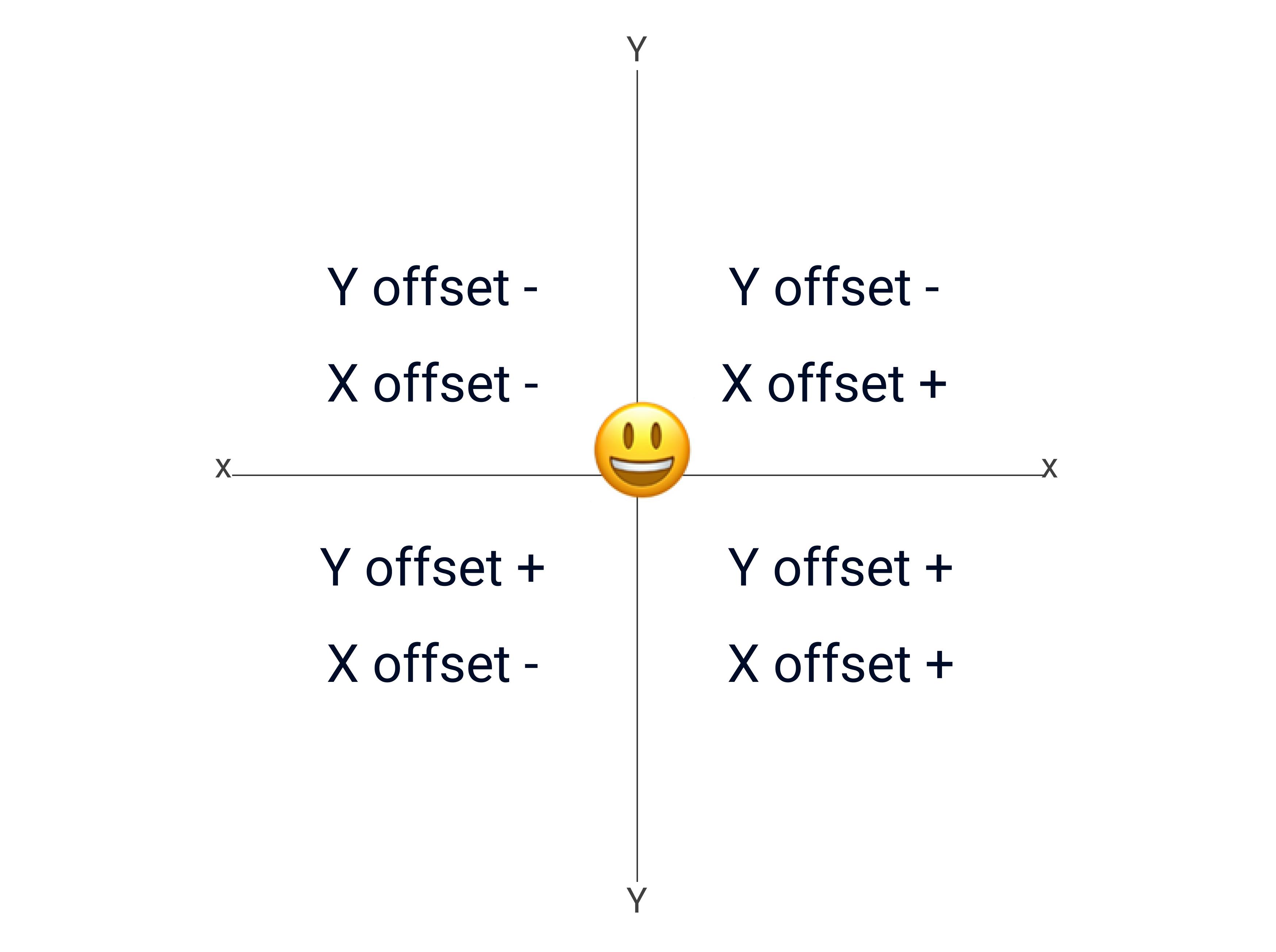 A plane consists of two axes (x and y-axis). The axes divide the plane into four quadrants(left, right, top and bottom.)
X offset represents the horizontal axis, while Y offset represents the vertical axis. When we are talking about box-shadows, the x offset is in charge of the shadow on the horizontal axis, i.e., from left to right or from right to left, dependent on the value of the shadow. Positive values will move the shadow from left to right and negative from right to left. In other words, we can say the right quadrant is a positive value while the left quadrant is a negative value. The Y offset is responsible for the shadow on the vertical axis from top to bottom. The top of the quadrant is a negative value, while the bottom is a positive value.
However, there is a tricky part to using the shadows.
The x and y offsets both complement each other. All objects exist on a plane, so objects are thrown towards the right or left, upwards or downwards. Still, the object will always be on a plane irrespective of the direction. The x and y-axis or offsets will always complement each other. As a designer, you need to know the properties of box shadows and which position they will move to on the plane.
Below are different examples of values involving the x and y offsets. Zero is a value and exists on the plane. So x and y can have zero values and still exist on the plane.
In CSS, a box-shadow is represented in this format.
box-shadow: 20px 0px 0px 0px;
It means The x offset is 20px, the Y offset is 0px the blur or blur ratio is 0px and the spread is 0px.
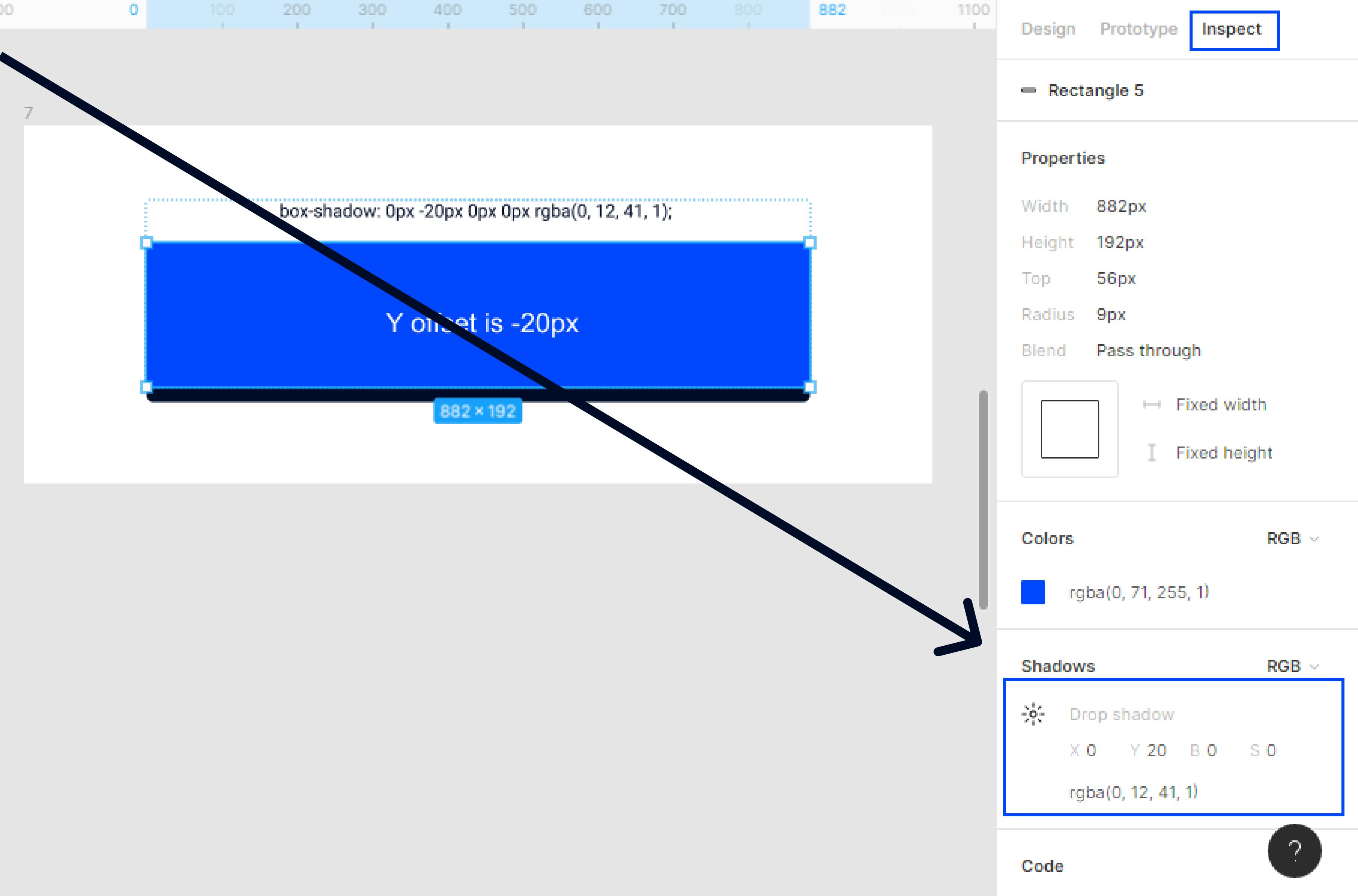
We can view this value on Figma by clicking on the Inspect panels object.
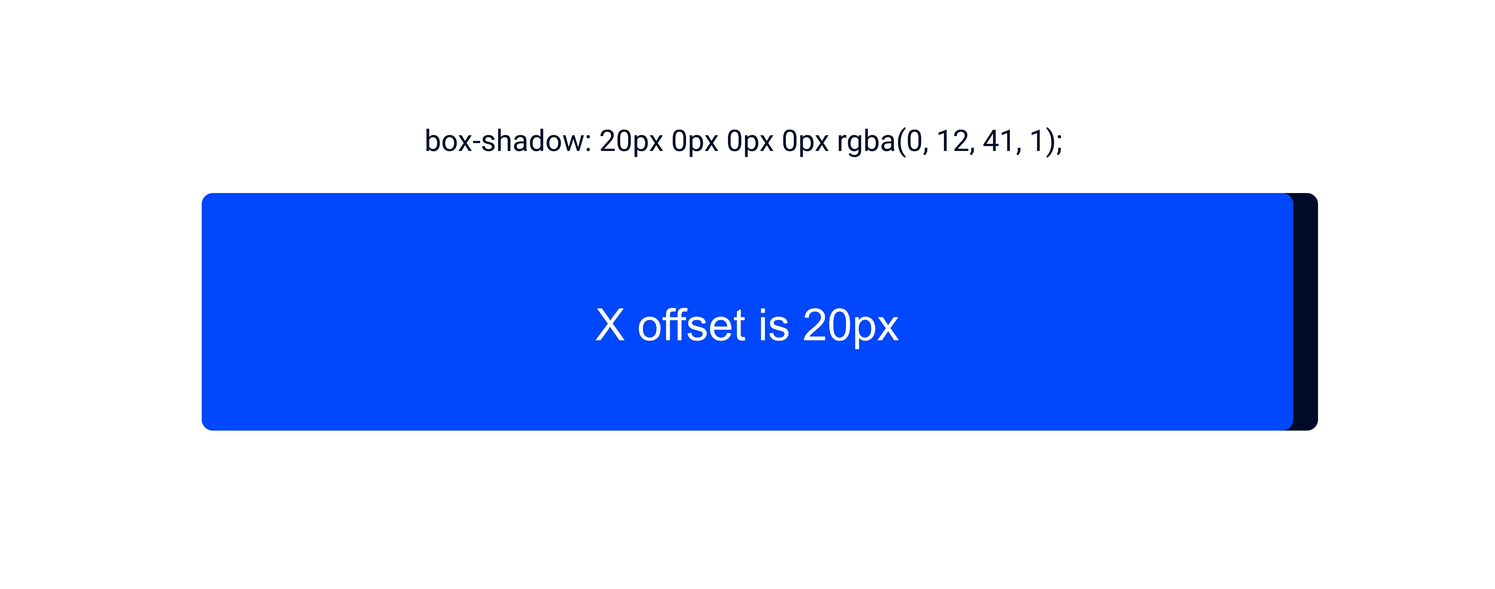 In the above example, we can see that the shadow is on the right side of the plane.
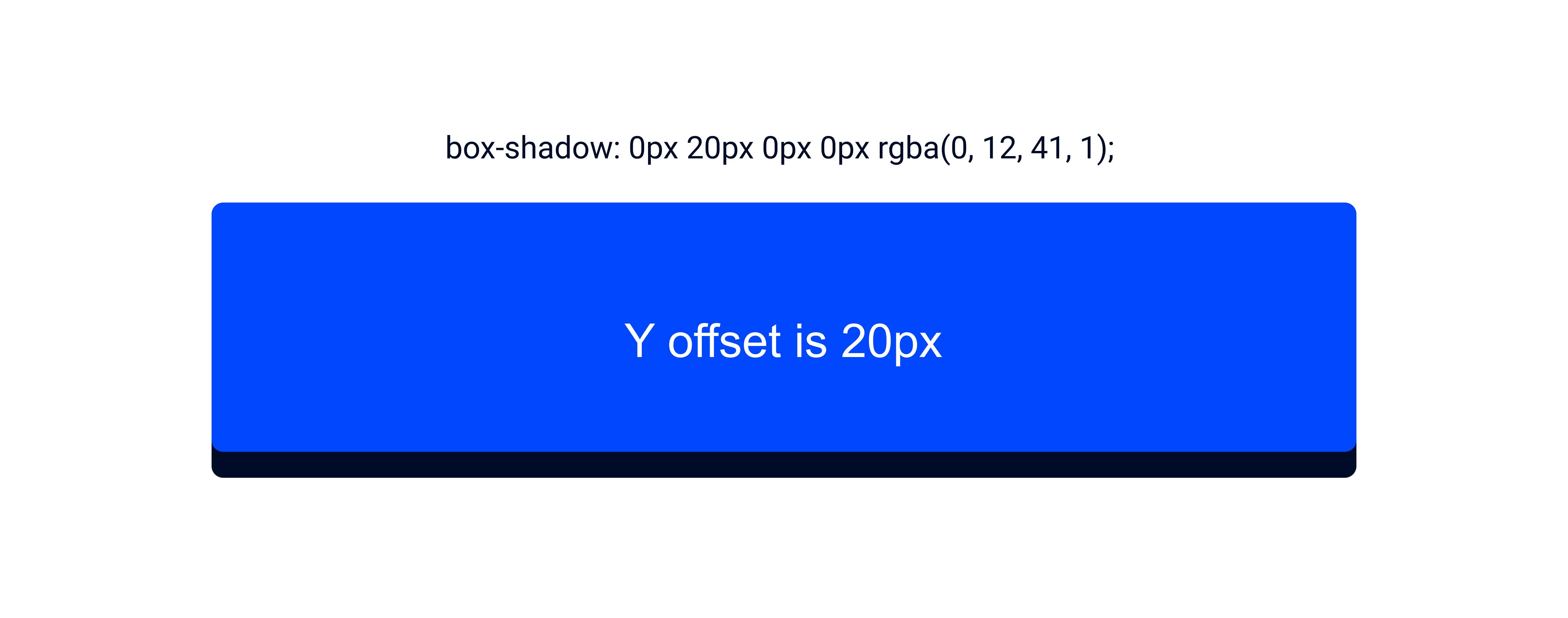 In the above example, we can see that the shadow is on the bottom of the plane.
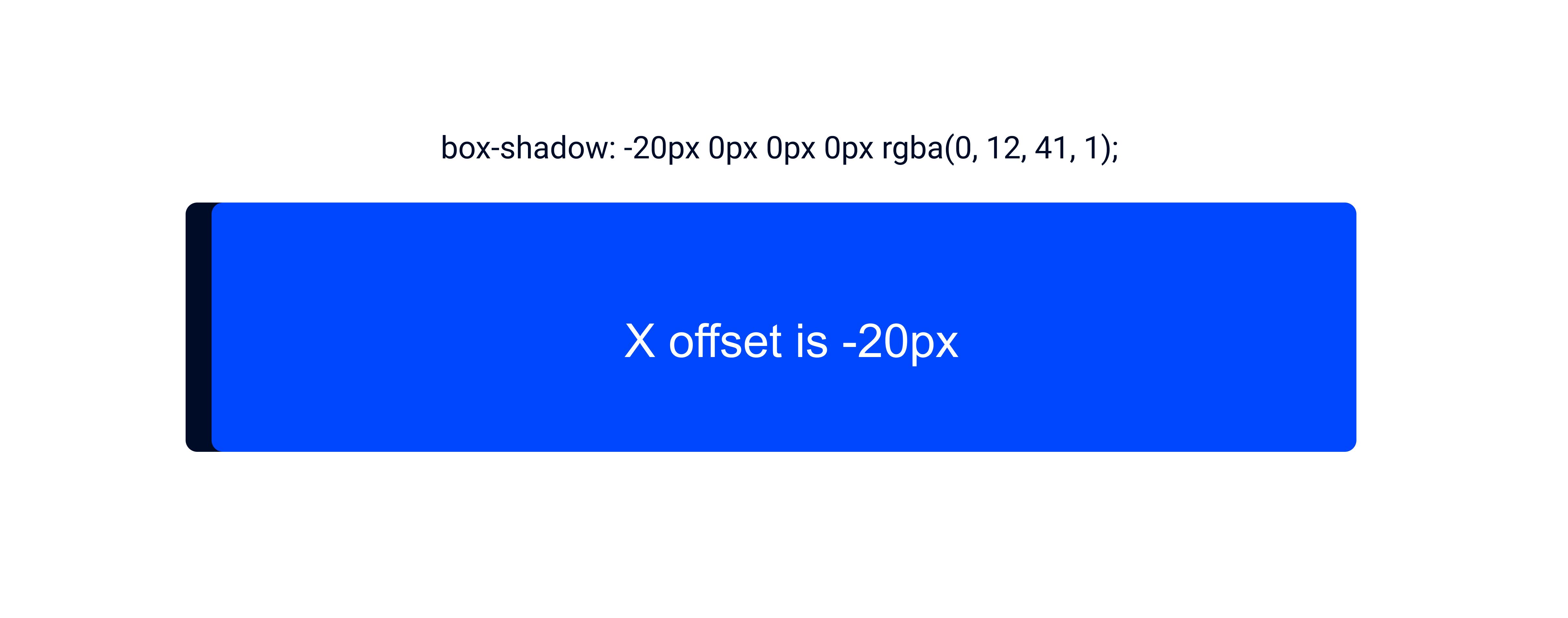 In the above example, we can see that the shadow is on the left side of the plane.
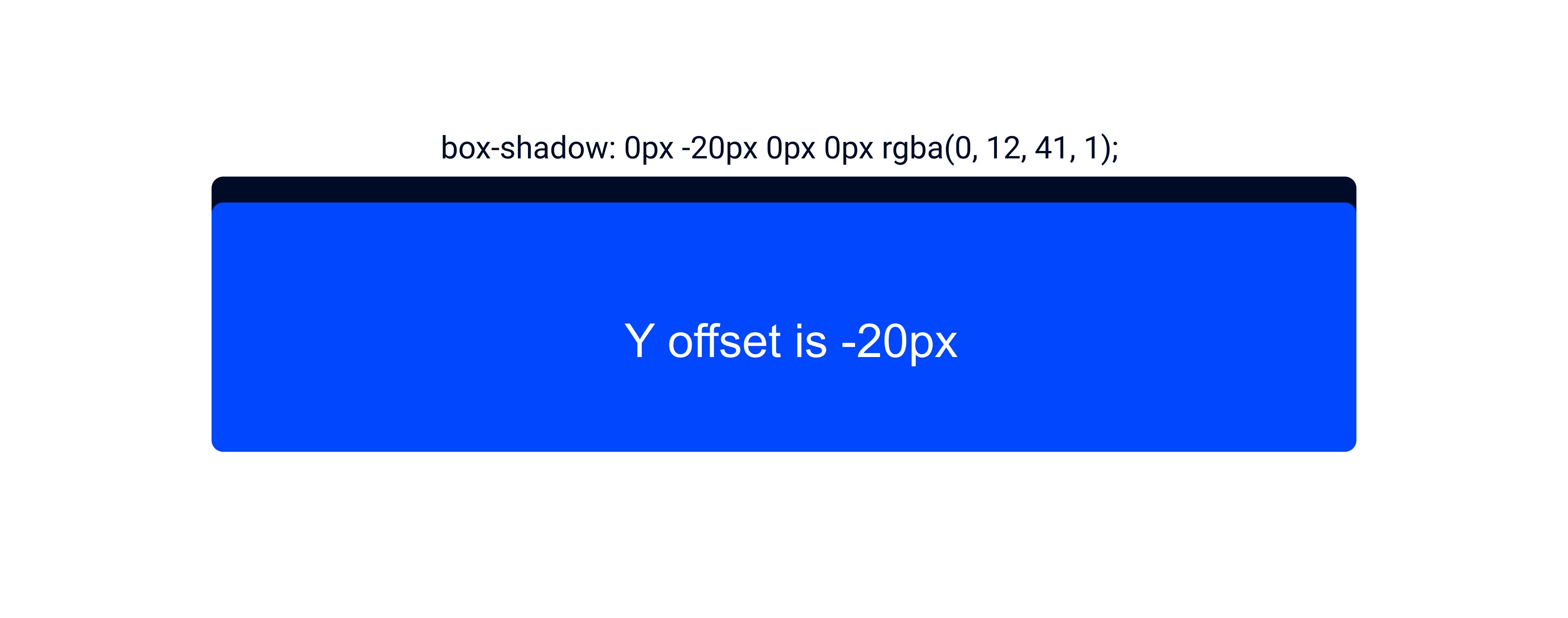 In the above example, we can see that the shadow is on the top side of the plane. The more the px the thicker the shadow.
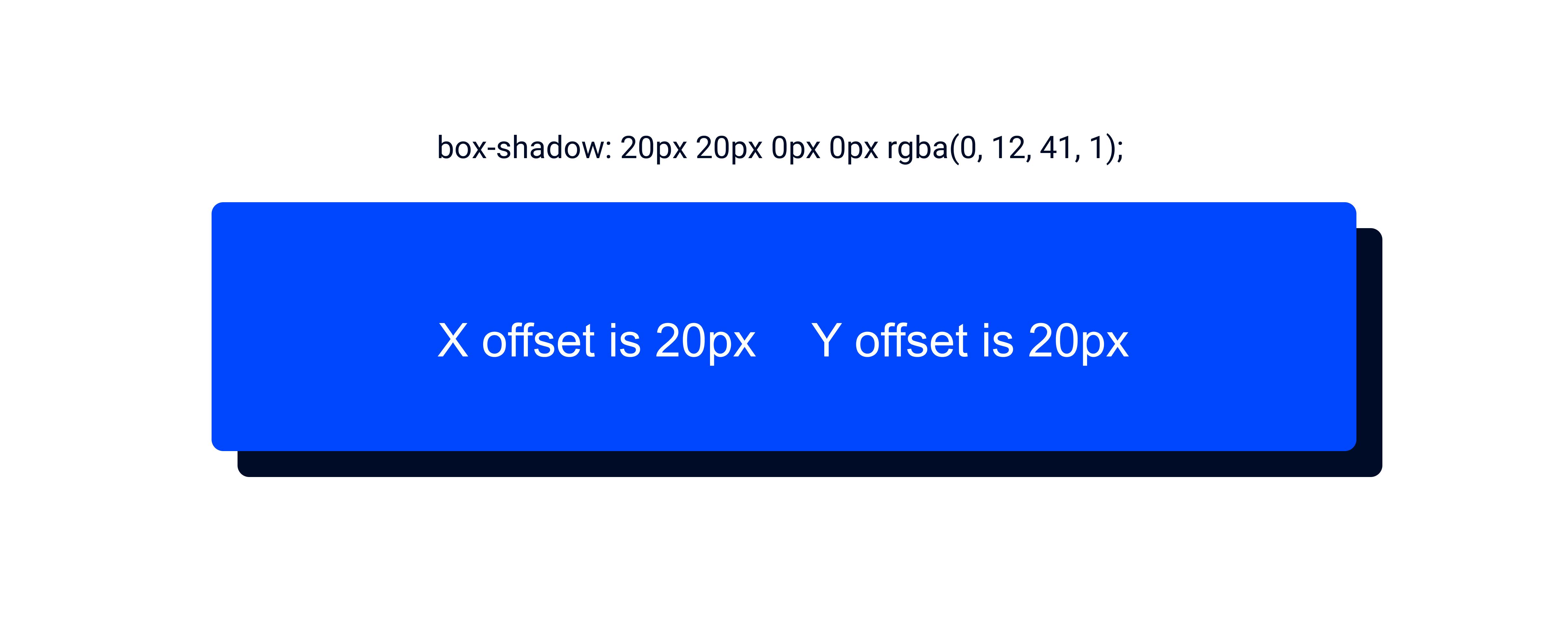 In the above example, we can see that the shadow is on the bottom right of the plane.
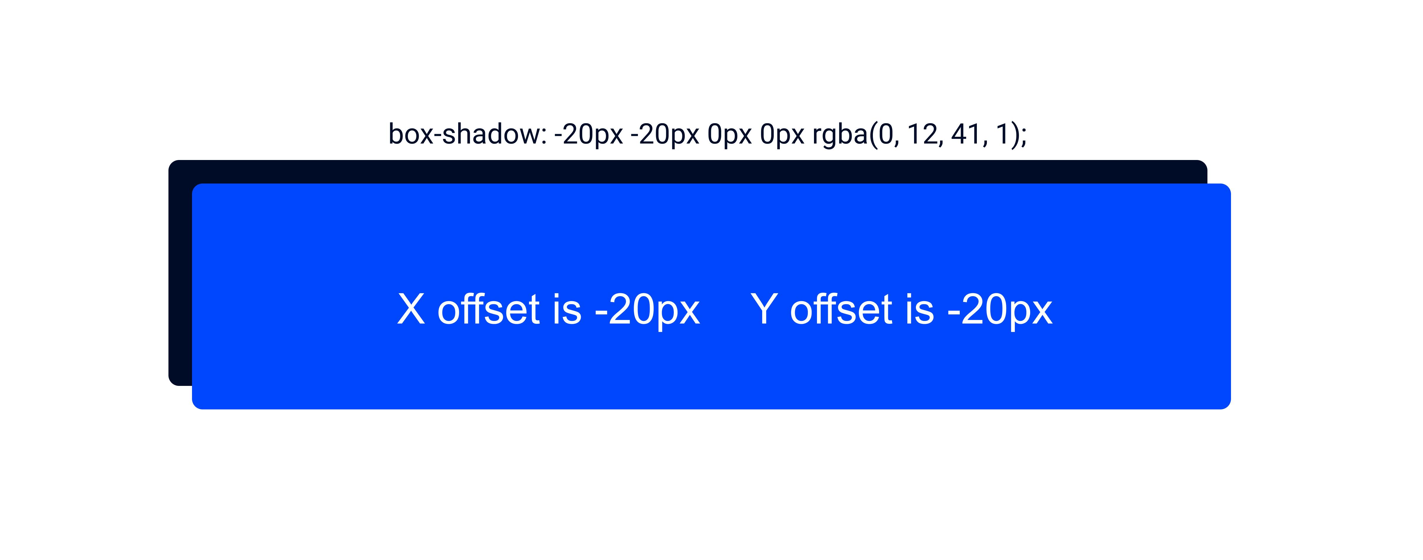 In the above example, we can see that the shadow is on the top left of the plane.
Blur-ratio/Blur: This will make the shadow less distinct or out of focus. The higher the blur, the less prominent and softer the shadow is; the lower the blur, the more complex the shadow.
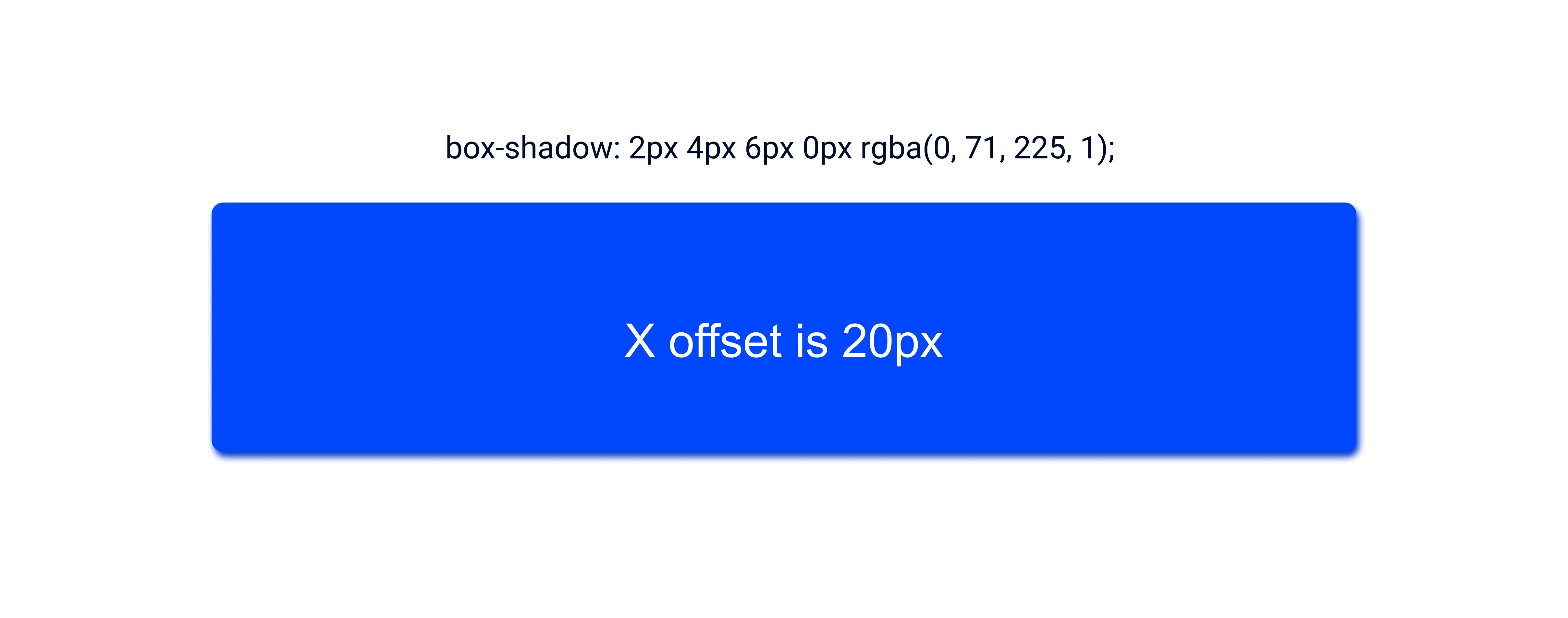 In the example above the blur ratio will help to distribute the shadows across the plane.
If we zoom into the picture, we will see the shadow on the X offset being moved from left to right and the Y Offset, the shadow is moved from the top to the bottom. The shadow is distributed more on the right side of the plane because the X offset takes a positive value. The same applies to the Y-offset which the shadow is distributed more to the bottom than the top because Y takes a positive value. However, we cant see the shadow on the top of the rectangle. The higher the blur, the softer the shadow, the lower the blur, the harder the shadow.
Spread: From the name spread, this will extend the area in which the shadow will occupy.
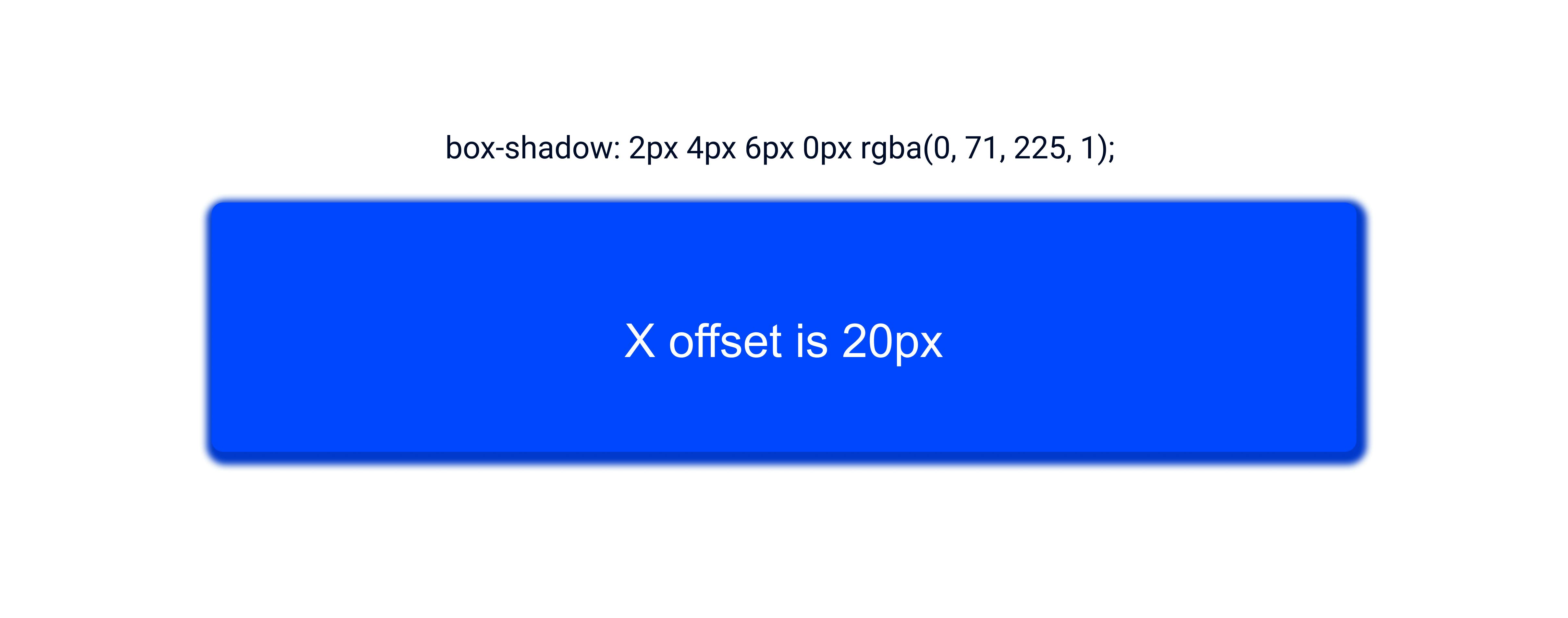 When we add a spread to the rectangle, the shadow becomes more prominent . The shadow at the top becomes more prominent. The spread helps to intensify the blur.
Apart from aesthetically, we can use box shadows for :
Button states
To give attention to objects.
Neumorphism
 Cowrywise makes great use of its clean box-shadows for its button states.
 Figma uses box shadows to give a different feel of images in this example above.
 Another practical example of the box shadows is in a UI design trend known as Neumorphism.
UX Collective gives a great example of how to use neumorphism here
Rules when using box shadows:
We've learned about the Y and X offsets, the spread, and the blur. However, there are some interesting rules to note when using a box-shadow.
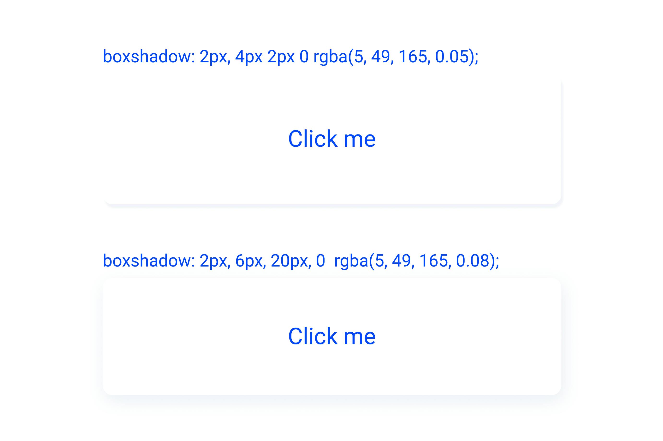
Rule 1: The 10% rule, Gill Simeon, a famous Youtuber, and UI/UX designer and programmer, let us know a 10% rule when using box shadows. What is a ten percent rule: It's a rule that tells you to use 10% of your alpha( hue/ color, which has a 10% opacity) for a shadow.
Rule 2: Box shadows are never 000000. This a mistake most designers make practically no shadow is 0000000; instead of using 000000 for your shadows, try using a darker shade of the hues
Rule 3: Never put box shadows on text, this is an outdated method of doing things, and it is not a good visual look.
Rule 4: Never use colored shadows on a black and white themed layout. There are also some other rules that we should know be are off, and Gill Simeon does a great job in this video tutorial on YouTube. here. You can also learn how to use box shadows in another video tutorial by learning UXID here
A good example of a box shadow will look like the diagram below:
Thanks for reading. Please leave a like and if you have any questions, drop it in the comment section. It took me a lot of time to bring resources together, and I hope this article has been able to serve its purpose.
